When creating artwork, you’re often drawn to pieces that instantly grab your attention. But have you ever stopped to think about what makes them so visually striking? The answer lies in the fundamental elements of composition: line, shape, color, value, texture, and space. These building blocks work together to create a harmonious balance that draws the viewer’s eye through the artwork. By mastering these elements, artists can craft pieces that convey their intended message with clarity and impact. In this article, we’ll explore each element in depth, discussing how they interact with one another to achieve visual interest. You’ll learn about the role of line in defining shape, the ways color can be used to evoke emotion, and techniques for incorporating texture to add depth and tactility to your work. By the end of this guide, you’ll be able to apply these elements thoughtfully in your own artwork.
Understanding the Basics
Composition is all about making intentional decisions, so let’s start by breaking down the fundamental elements that create visual interest: line, shape, form, value, and texture. These building blocks will serve as our foundation for exploring more complex concepts.
What is Composition?
Composition is the deliberate arrangement of visual elements within an artwork or design. It’s what guides the viewer’s eye and creates a cohesive message. Think of composition like the choreography of a dance – every step, every movement, every interaction with its surroundings contributes to the overall performance.
In photography, for instance, a well-composed image might lead your gaze from a central subject through a carefully framed doorway or around a curved line of trees. In painting, it could be achieved by placing contrasting shapes and colors in a way that invites the viewer’s eye to explore. Effective composition balances visual interest with negative space, allowing the viewer’s attention to settle on key elements.
A simple yet effective example is the rule of thirds: dividing your image or canvas into thirds both horizontally and vertically creates nine equal parts. Placing important elements along these lines – especially at intersections – can create a more balanced and visually appealing composition.
Principles vs. Elements of Composition
When it comes to creating visually appealing compositions, many artists and designers struggle to distinguish between principles and elements of composition. However, understanding the difference is crucial for effective visual communication.
The principles of composition are like the underlying rules that govern how we perceive and interact with a piece of art or design. Balance, contrast, emphasis, movement, pattern, unity, and variety are some of the key principles that guide our creative decisions. These principles cannot be seen; they are intangible concepts that influence the way elements work together to create a cohesive visual message.
On the other hand, the elements of composition are tangible building blocks that we use to apply these principles. Line, shape, form, value, color, and texture are some of the fundamental elements that artists and designers manipulate to achieve their desired effects. For instance, using a strong line can create emphasis or lead the viewer’s eye through a composition, while employing contrasting colors can add visual interest and balance.
To effectively apply principles, you need to understand how to use these elements in harmony with one another. By combining lines with shapes, for example, you can create dynamic compositions that draw attention and engage your audience.
The Visual Elements
Composition is all about creating a visual hierarchy, and color plays a crucial role in drawing the viewer’s attention. Let’s explore how different colors can be used to create balance and emphasis.
Line: Defining Space and Shape
Lines play a crucial role in defining space and shape within a composition. Their width, direction, and continuity can significantly impact the mood or emotion evoked by the artwork. A thick, continuous line can create a sense of tension or energy, while a thin, fragmented line may convey delicacy or fragility.
In terms of defining space, lines can be used to establish boundaries between different areas of the composition. For example, a bold, black line might separate a figure from its background, creating a clear visual hierarchy. Conversely, a subtle, curved line could subtly suggest a sense of depth or dimensionality.
The direction and continuity of lines also contribute to their expressive potential. A diagonal line can create a sense of movement or dynamism, while a horizontal line may evoke feelings of stability or calmness. By varying the width, direction, and continuity of lines, artists can effectively manipulate space and shape to convey meaning and engage the viewer’s attention.
In practical terms, consider using different line weights and styles to separate elements within your composition, guide the viewer’s eye, or create a sense of movement.
Shape: Geometric and Organic Forms
Shapes can greatly impact the visual appeal and meaning of an image. They are two-dimensional forms with defined edges, which set them apart from three-dimensional objects. Geometric shapes, such as squares and circles, have sharp corners and smooth curves. These forms create a sense of order and stability in a composition. On the other hand, organic shapes, like free-flowing lines or irregular blobs, add a touch of dynamism and unpredictability.
To create a visually appealing image, balance both geometric and organic shapes. For example, placing a perfect circle in front of an irregular shape can create visual tension. Conversely, combining multiple geometric shapes can lead to a sense of harmony. When using organic shapes, consider the negative space around them. This allows the viewer’s eye to move freely within the composition.
Some practical tips for working with shapes include:
- Using geometric shapes to create frames or borders
- Combining geometric and organic shapes to add depth and interest
- Experimenting with different line weights and styles to make organic shapes more defined
- Leaving negative space around irregular shapes to create visual flow
Using Color Effectively
Effective use of color can elevate a composition from good to great, adding depth and emotion that draws the viewer’s eye and lingers in their memory. Let’s explore how to harness the power of color in your art.
The Psychology of Color
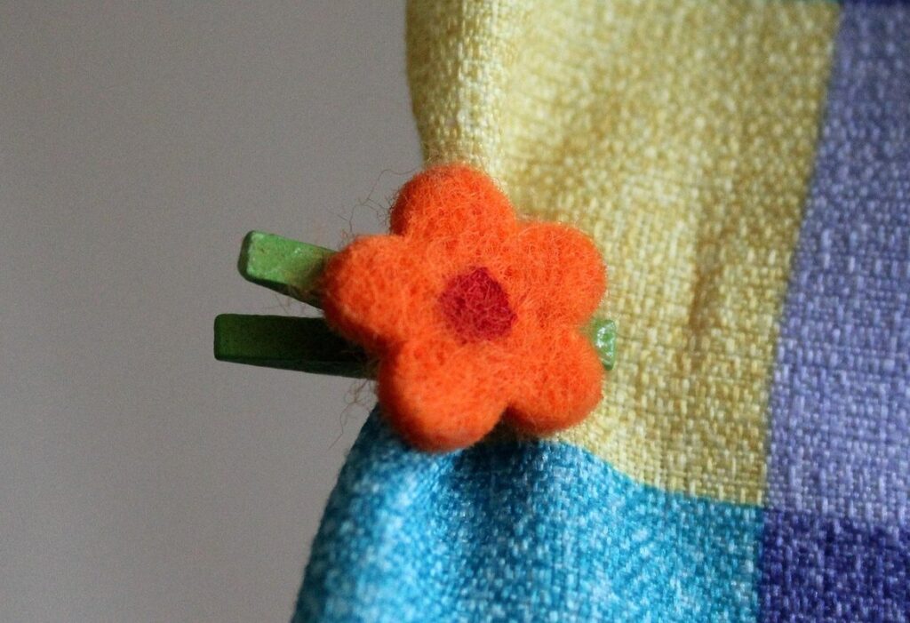
Colors play a crucial role in composition by evoking emotions and conveying meaning. Different colors can have distinct psychological impacts, making it essential to understand their effects for effective composition. For instance, red is often associated with energy, passion, and warmth, while blue is commonly linked to calmness, trust, and serenity.
In visual communication, color choices can influence how viewers perceive an image or message. Warm colors like orange and yellow tend to stimulate attention and encourage action, whereas cool colors such as green and purple promote relaxation and contemplation. Understanding the psychological impact of different colors allows you to intentionally guide the viewer’s focus and emotions in your composition.
When selecting colors for a composition, consider the context and intended audience. For example, using bright and vibrant colors might be suitable for a playful or attention-grabbing poster but would not be ideal for a more subdued and professional setting. In contrast, muted tones can create a soothing atmosphere, making them perfect for art pieces meant to evoke calmness.
By understanding the psychology of color, you can strategically use color to enhance the emotional impact of your composition and effectively convey your message. This awareness enables you to make informed decisions about color choices and ensure that they support your artistic vision.
Color Harmony: A Guide to Creating Balance
Color harmony is the foundation of creating balanced compositions. When selecting colors to work together, consider monochromatic schemes, which use different shades of a single hue to create a cohesive look. This approach creates visual balance by repeating a dominant color and its various tints and tones.
To achieve balance with complementary colors, pair hues that are opposite each other on the color wheel. For example, blue and orange or red and green. These contrasting colors can add energy and interest to an image but require careful placement to avoid visual tension. Analogous hues, which are next to each other on the color wheel, also create harmony by sharing a common base tone.
When applying these principles, remember that balance is not just about aesthetics; it’s also about guiding the viewer’s attention through the composition. Use color harmony to create focal points and draw the eye to specific areas of interest. Experiment with different color schemes to find what works best for your image. Start by selecting a dominant color and then choose complementary or analogous colors to balance it out, creating a visually appealing composition that engages the viewer.
Exploring Texture and Value
Texture and value are two fundamental elements of composition that add depth, interest, and emotion to your visual work. By mastering these elements, you can create engaging and effective compositions.
(Note: I will remove this note as per instructions)
Adding Depth with Texture
Texture adds depth and visual interest to an artwork by providing a tangible quality that invites the viewer’s attention. When incorporated effectively, texture can transform a composition from two-dimensional to three-dimensional, creating a sense of tactility and drawing the viewer in.
Consider the difference between a photograph of a rough stone wall and one taken with a textured filter applied digitally. The latter creates an almost palpable sense of ruggedness, making it easier for the viewer to imagine running their hand over its surface. This tactile quality can be achieved through various techniques, including layering paint or medium in a painting, using a combination of brushstrokes and mediums in printmaking, or even incorporating found objects into a mixed-media piece.
To add depth with texture, experiment with different materials and techniques to achieve the desired effect. For example, you might use thick, heavy impasto to create raised, three-dimensional forms, or apply thin layers of transparent glaze to build up subtle, nuanced textures. By embracing texture as an element of composition, artists can inject their work with a sense of tactility and visual interest that engages viewers on multiple levels.
The Power of Value: Creating Contrast and Emphasis
Value plays a crucial role in creating contrast and emphasis within an image. By adjusting the lightness or darkness of colors, you can draw attention to specific elements and guide the viewer’s eye through the composition. When values are varied, they create visual interest and prevent monotony.
To emphasize important details, use dark values for focal points and lighter values for secondary elements. This technique is particularly effective in portraits where the subject’s eyes or mouth are given prominent attention. Conversely, when aiming to create a sense of calmness or serenity, employ light values throughout the composition.
A common mistake is overusing value contrast, leading to an image that feels jarring or unpleasant. To avoid this, strike a balance between contrasting and harmonious elements within your composition. This might involve introducing mid-tones to smooth out transitions between values.
Practically applying value to create emphasis can be achieved by using simple techniques such as adjusting the exposure in a photograph or choosing colors with varying lightness levels for an illustration.
Mastering Form and Space
Effective composition relies heavily on mastering the interplay between form and space, creating a visually appealing balance of positive and negative elements. By understanding how to manipulate these fundamental aspects, you’ll create more engaging images.
Understanding Negative Space
When considering composition, it’s easy to focus on the objects themselves and neglect the space around them. However, negative space is a crucial element in creating visual balance and harmony. It refers to the area between and around objects, and it can have a profound impact on how our eyes move through an image.
Negative space can be used to create a sense of calmness or tension, depending on its context. In photography, for example, using negative space to frame a subject can lead the viewer’s eye directly to the main focus point. In graphic design, negative space is often used to create visual flow and guide the reader through a composition.
To effectively use negative space, consider the following tips:
- Leave some breathing room between objects to avoid clutter.
- Use a clear background to allow your subject to stand out.
- Experiment with different shapes and sizes of negative space to achieve the desired effect.
- Pay attention to the edges of objects – soft or hard? How do they interact with their surroundings?
- Consider using negative space to create a sense of depth or distance in your composition.
By paying attention to these details, you can harness the power of negative space to elevate your compositions and capture the viewer’s attention.
Creating Depth with Atmospheric Perspective
Atmospheric perspective is a powerful tool for creating depth and visual interest in artworks. By using color and contrast to create the illusion of distance, artists can draw viewers into their composition and create a sense of immersion. The key to atmospheric perspective lies in the way colors fade and blend as they recede into the background.
In general, warm colors like oranges and yellows tend to advance, while cool colors like blues and greens recede. This means that objects or areas with these warm colors will appear closer to the viewer, while those with cool colors will seem farther away. Consider a landscape painting: a bright yellow sun in the foreground will draw attention to itself, while a soft blue haze on the horizon creates a sense of depth.
To apply atmospheric perspective effectively, try using a gradual transition from warm to cool colors as your composition recedes into the background. This can be achieved through subtle shifts in value and color saturation, rather than abrupt changes that might feel jarring or unnatural. By mastering this technique, you’ll be able to create artworks that invite viewers to explore their depths.
Advanced Composition Techniques
Now that you’ve mastered the basics, it’s time to elevate your skills and learn how to create visually stunning compositions using more complex techniques. Let’s explore advanced methods for manipulating depth, form, and texture.
Using Symmetry and Asymmetry Effectively
Symmetry creates a sense of order and balance, while asymmetry adds visual interest and creates a sense of movement. This dichotomy is essential to master when it comes to composition.
When used effectively, symmetry can evoke feelings of calmness and stability. A classic example is the arrangement of flowers in a vase – by mirroring the placement of each bloom on either side, you create a visually appealing and harmonious image. However, overusing symmetry can lead to boredom and predictability, making it essential to balance symmetrical elements with asymmetrical ones.
Asymmetry, on the other hand, injects energy and dynamism into your composition. By placing visual weight unevenly, you draw the viewer’s attention to specific areas of the image. A famous example is Vincent van Gogh’s Starry Night – the swirling clouds and cypress tree create a sense of movement that draws the viewer in.
To strike the right balance between symmetry and asymmetry, consider the following: use symmetrical elements sparingly, reserving them for focal points or central areas; experiment with different types of asymmetry, such as radial or diagonal compositions. By mastering this fundamental aspect of composition, you’ll be able to create visually striking images that capture your audience’s attention.
Creating Dynamic Compositions with Visual Flow
When creating dynamic compositions, visual flow is a crucial element to consider. It refers to the path the viewer’s eye follows through an artwork, and it can be used to guide attention and create energy. A well-designed visual flow can draw the viewer’s eye through the composition, creating a sense of movement and engagement.
To achieve this, artists can use leading lines, which are visible paths that lead the viewer’s eye through the image. These can be created using a variety of elements, such as roads, rivers, or shorelines. Artists can also use shapes and forms to create visual flow by placing them in a way that guides the viewer’s eye.
For example, in a landscape painting, an artist might place a winding road leading up to a mountain peak, creating a sense of movement and energy. Similarly, in a still life composition, an artist might arrange objects in a way that creates a diagonal line from one corner of the canvas to the other, guiding the viewer’s eye through the image.
A simple tip for artists is to experiment with different compositions by placing their subject matter off-center or at unusual angles, creating visual flow and drawing the viewer’s eye through the image.
Frequently Asked Questions
How to Apply Composition Principles in Real-World Art Projects
When working on an actual art project, how can you practically apply the principles of composition that you’ve learned?
Yes. Start by breaking down your project into smaller sections and applying one principle at a time. For example, begin with balance or contrast and see how it affects the overall piece. Then, move on to another principle, such as emphasis or visual flow.
Can I Use Only One Element of Composition in My Artwork?
Can you create an effective composition using just one element, like line or shape?
Yes. While multiple elements can add depth and interest, a single element used thoughtfully can still convey meaning and create impact. Consider the mood or emotion you want to evoke and use that element accordingly.
How Do I Balance Composition with Content in My Artwork?
When working on an artwork that requires balance between composition and content, what’s the best approach?
Start by defining your message or theme through content, then use composition elements like line, shape, and value to guide the viewer’s eye and create visual flow. This will help you achieve a balance between the two.
What If My Artwork Has Multiple Focal Points? How Do I Handle Visual Flow?
How do you handle artworks with multiple focal points that can compete for attention?
When dealing with multiple focal points, use visual flow to guide the viewer’s eye through the composition. You can create pathways using lines, shapes, and values to lead the viewer from one point of interest to another.
Can I Use Color Harmony in Abstract Artworks?
Can color harmony be applied effectively in abstract artworks that don’t have a specific subject or message?
Yes. While abstract art may not follow traditional representation, color harmony can still create a cohesive visual experience. Consider using analogous hues or monochromatic schemes to create a sense of continuity and balance.
What If I’m Not Good at Drawing Lines? Can I Still Create Effective Composition?
What if you struggle with drawing lines or creating shapes – is it still possible to create effective composition?
Yes. While technical skills are important, they’re not the only factor in creating effective composition. Consider using other elements like texture, value, and color to add depth and interest to your artwork.