
You’ve poured your heart into creating a stunning digital sketch, but now you’re faced with the daunting task of turning it into a professional-looking final illustration. Whether you’re working on a web design project or preparing artwork for print, this critical step can make all the difference in capturing your audience’s attention. Unfortunately, many artists struggle to bridge the gap between their initial concept and polished finish. In this comprehensive guide, we’ll explore the essential tools, color theory principles, and advanced techniques you need to take your digital sketch from rough-around-the-edges to breathtaking final illustration. By the end of this article, you’ll know how to refine your artwork for both web and print applications, giving you the confidence to bring your creative vision to life with precision and finesse.
Understanding the Digital Illustration Process
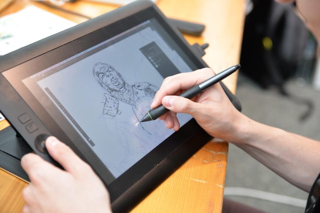
Now that you have a solid foundation in digital sketching, let’s break down the step-by-step process of turning your rough sketches into polished final illustrations. We’ll explore each stage, from refining your concept to adding color and texture.
Setting Up Your Tools and Software
When it comes to digital illustration, having the right tools and software is crucial for achieving professional-looking results. You’ll want to start by investing in a good computer setup, which includes a powerful processor, ample RAM, and a dedicated graphics card. This will ensure that your programs run smoothly and efficiently.
A good monitor with accurate color representation is also essential for digital illustration. Look for a monitor with high resolution (at least 24 inches) and wide color gamut support. Some popular options include the BenQ PD2700U and the Eizo ColorEdge CG319X. These monitors offer excellent color accuracy, making them ideal for artists who need to work with precise color palettes.
In terms of software, you’ll likely want to invest in a vector graphics editor like Adobe Illustrator or a raster graphics editor like Photoshop. Both programs have their strengths and weaknesses, so it’s worth experimenting with each to see which one suits your needs best. You may also consider using specialized illustration software like Clip Studio Paint or Krita, which offer a range of features specifically designed for digital artists.
Preparing Your Reference Materials
Gathering accurate and detailed reference materials is essential for creating realistic digital illustrations. Real-world references can be sourced from photographs, personal experiences, or observations of nature. When collecting images, consider the lighting conditions, textures, and composition to ensure they align with your illustration’s requirements.
You may also use 3D modeling software to create custom environments that match your concept. This allows for precise control over architecture, landscape, and other features. Experimenting with different textures and patterns can add depth and interest to your scene. For instance, you could combine realistic stone or wood textures with abstract geometric patterns to create a unique atmosphere.
To incorporate these references into your illustration, consider the following tips:
• Take note of the color palette and lighting effects in your reference images.
• Experiment with different software tools to manipulate and merge 3D models with 2D elements.
• Use texture libraries or create custom textures from scratch to add depth and realism to your scene.
By investing time in gathering and experimenting with reference materials, you’ll be able to craft a more accurate and engaging digital illustration.
Understanding Color Theory and Palette Creation
Understanding color theory is essential for creating a cohesive and visually appealing digital illustration. At its core, color theory involves understanding how colors interact with each other to produce different moods and effects. A fundamental concept in color theory is the color wheel, which shows how colors are organized into primary, secondary, and tertiary categories. By understanding these relationships, you can create harmonious palettes that enhance your illustration’s overall mood.
When creating a palette, it’s essential to balance warm and cool colors. Warm colors like reds and oranges evoke feelings of energy and warmth, while cool colors like blues and greens are calming and soothing. You can use the 60-30-10 rule as a starting point: allocate 60% of your palette to a dominant color, 30% to a secondary color, and 10% to an accent color. This will give you a balanced and visually appealing palette.
To take it further, consider the contrast between colors. High contrast can create visual interest, but be cautious not to overdo it – too much contrast can be overwhelming. Instead, aim for a subtle balance that guides the viewer’s eye through your illustration. By understanding color theory basics, you’ll be able to create cohesive palettes that elevate your digital illustrations and convey the desired mood or atmosphere.
Sketching and Conceptualization
Now that you have a rough idea of your illustration style, let’s explore the foundation of creating compelling artwork: developing a solid concept through sketching. Effective conceptualization is key to bringing your vision to life.
Developing Your Idea and Creating a Thumbnail
Developing a clear concept before starting an illustration is crucial for achieving a cohesive and visually appealing final piece. This process begins with brainstorming, where you freely associate ideas related to the subject matter. Take a few minutes to jot down key words, emotions, and themes that come to mind. For instance, if you’re illustrating a fantasy creature, your brainstorming might include words like “mythical,” “majestic,” and “ancient.”
Next, research reference images to help solidify your concept. Look for images that evoke the mood and atmosphere you want to convey in your illustration. Save these references in a folder or document labeled with the project’s name, so you can easily access them later. Finally, create a thumbnail sketch to visualize your final piece. This small-scale study should capture the essential elements of composition, proportion, and overall design.
A good thumbnail should take no more than 15-30 minutes to complete, allowing you to quickly experiment with different ideas without investing too much time. Remember that this early stage is about exploring possibilities, not creating a polished final product. By developing your idea and creating a clear thumbnail concept, you’ll establish a strong foundation for the rest of your illustration process.
Experimenting with Different Techniques and Styles
When capturing movement and energy in your illustrations, experimentation with different techniques and styles is key. Start by exploring various brushstrokes, such as drybrushing for a textured look or wet-on-wet for smooth blending. You can also experiment with custom brushes or textures to add visual interest.
To achieve a dynamic effect, consider combining different brushstrokes or layering them in specific ways. For example, you might use a bold brushstroke for the main elements of your composition and then soften it with a wet-on-wet technique. This can help create a sense of movement and energy.
When experimenting with styles, don’t be afraid to try something new and different from what you typically do. Look to other artists or styles for inspiration – you might find that a particular style or technique works perfectly for the piece you’re working on. Some popular techniques include:
• Stylized brushwork: using bold lines and vibrant colors to create a dynamic effect
• Watercolor-inspired textures: adding soft, blended edges and subtle color gradations
• Graffiti-style lettering: incorporating bold, colorful text into your composition
Remember that experimentation is all about trying new things and seeing what works for you. Don’t be afraid to make mistakes – they can often lead to interesting and unexpected results.
Refining Your Sketch and Creating a Strong Composition
When refining your sketch and creating a strong composition, consider the principles of balance and negative space. Balance refers to the distribution of visual weight within an image, achieved through symmetry, asymmetry, or radial balance. Aim for a balance that guides the viewer’s eye through the illustration.
Negative space is just as important as positive elements in your design. It provides breathing room, creates visual flow, and prevents clutter. Remove unnecessary details and simplify complex shapes to create a more cohesive composition. Consider using a grid or dividing your image into thirds to maintain balance and achieve better placement of key elements.
To apply these principles effectively, experiment with different composition techniques. Play with the rule of thirds, leading lines, and framing devices to create visually appealing arrangements. Remember that a strong composition is not just about aesthetics; it also affects the overall mood and narrative of your illustration. Balance, negative space, and composition are essential elements in creating engaging digital illustrations that capture the viewer’s attention.
Turning Your Sketch into a Digital Illustration
Now that you’ve got your rough sketch, let’s talk about how to refine it and bring it to life as a digital illustration using various software tools. This next step is crucial for achieving professional results.
Vectorizing Your Sketch and Building Up Layers
Vector graphics editors like Adobe Illustrator are ideal for turning your sketch into a digital illustration. To vectorize your sketch, you’ll need to create custom shapes and paths from your original drawing. This process involves tracing over your lines and details with the Pen tool, creating smooth curves and precise edges.
When building up layers, start by creating separate layers for different components of your artwork, such as the main subject, background, and foreground. Use the Layer panel to organize these layers and make adjustments as needed. As you work on each component, use the ‘Create New Shape’ tool to create custom shapes that can be manipulated independently.
Consider using the Pathfinder panel to merge or subtract shapes, allowing for more precise control over your design. For example, if you’re creating a illustration with multiple interlocking shapes, use the Pathfinder to combine them into a single shape. This will help streamline your workflow and make it easier to edit your artwork later on. By breaking down your sketch into manageable components and using vector graphics tools, you’ll be able to refine your lines, details, and composition with precision and control.
Adding Textures and Patterns to Enhance Depth and Interest
When adding textures and patterns to your illustrations, it’s essential to strike a balance between creating visual interest and overpowering the main image. Start by deciding which areas of the illustration benefit from texture or pattern overlays. Typically, these are backgrounds, clothing, or accessories that need depth and dimension.
For subtle textures, try using overlay layers with a low opacity setting (around 20-30%). This allows you to maintain control over the amount of texture applied without overwhelming the image. You can find high-resolution texture packs online or create your own by photographing real-world objects.
Patterns, on the other hand, work best when used in moderation. Avoid using too many patterns at once, as this can lead to visual overload. Instead, focus on 1-2 key areas where a pattern adds significant depth and interest. For example, you might use a subtle gradient or geometric pattern on a character’s cloak or a background element.
Some popular techniques for adding patterns include using brushes with texture built-in (e.g., textured brushes in Adobe Photoshop) or manually creating a repeating pattern by duplicating and arranging shapes.
Refining Your Colors and Creating a Realistic Finish
To achieve a realistic finish in your digital illustration, you need to refine your colors and balance them effectively. This involves adjusting the color balance, contrast, and saturation levels to evoke the desired mood and atmosphere. Start by checking the overall color temperature of your image: is it leaning too cool or warm? You can use the color wheel as a reference to identify areas that could benefit from a shift in tone.
When working with Adobe Photoshop, use the Color Balance tool to make targeted adjustments. This tool allows you to fine-tune the color cast of specific areas within your image. For example, if your subject is indoors with warm lighting, you can apply a slight warmth to the overall scene using this feature. To avoid over-saturating your colors, work in small increments and use the Undo feature frequently.
Consider experimenting with different contrast levels to create depth and interest. A higher contrast can make certain areas pop, while a lower contrast can blend them into the background more smoothly. You can also use the Levels tool to adjust the black, white, and gray points of your image, which helps maintain a balanced look without sacrificing detail.
Advanced Techniques for Finalizing Your Illustration
Now that you’ve refined your illustration, it’s time to focus on advanced techniques for adding polish and finishing touches. This involves refining details and textures.
Working with Transparencies and Layer Blending Modes
Transparencies and layer blending modes can greatly enhance the visual interest of your illustration. Understanding how to use different blend modes effectively is key to creating unique and engaging effects.
Let’s start with transparencies. When working with layers, you can add a transparency to any layer by adjusting its opacity or using a mask. This allows you to create complex compositions where elements overlap seamlessly. For example, if you’re illustrating a cityscape at sunset, you might use a high-opacity layer for the buildings and a lower-opacity layer for the sky, allowing the two to blend together subtly.
Different blending modes can be used to achieve various visual effects. Multiply mode, for instance, darkens the underlying layers, making it perfect for creating deep shadows or adding depth to your illustration. Screen mode, on the other hand, lightens the underlying layers, ideal for adding highlights or creating a sense of glow. Experimenting with different blend modes can help you achieve the desired look and feel for your illustration.
To get the most out of blending modes, try combining them with transparencies to create complex, layered effects. This will allow you to create intricate details and textures that add depth and visual interest to your illustration.
Creating Realistic Lighting and Shading Effects
Creating realistic lighting and shading effects is crucial for bringing depth and dimension to your illustration. To achieve natural-looking shadows and highlights, you’ll need to work with layer blending modes. These modes determine how layers interact with each other, allowing you to create complex, nuanced light interactions.
Start by selecting a suitable brush or texture that can capture the subtleties of lighting. Experiment with different settings within your graphics editor, such as opacity and flow, to achieve the desired effect. You can also use layer blending modes like Multiply or Screen to enhance shadows and highlights.
To add depth to your illustration, consider using textures that mimic real-world surfaces. For instance, a rough stone texture can create interesting, organic-looking shadows. When working with layer blending modes, remember that some modes can produce unexpected results if not used carefully. Experiment with different modes on separate layers to achieve the desired effect, and don’t be afraid to merge or flatten your illustration when necessary.
When combining multiple light sources, use a layer blending mode like Overlay or Soft Light to create soft, blended shadows. This is particularly useful for illustrating scenes with complex lighting scenarios.
Final Touches: Saving for Web and Print
When saving your illustration for web and print use, it’s essential to create multiple files tailored to each medium. Start by saving a JPEG file with a moderate compression level (around 80-90%) for web use. This format is ideal for online platforms due to its small file size without sacrificing too much image quality.
For print, save a high-resolution TIFF or PSD file. These formats preserve the original color data and ensure your illustration looks vibrant on paper. Typically, a resolution of 300 DPI (dots per inch) is suitable for most print applications, but check with the client or printer to confirm their specific requirements.
To optimize images for web use, consider compressing them further using tools like TinyPNG or ImageOptim. These services can help reduce file size while maintaining image quality. Additionally, save a smaller version of your illustration in PNG format (8-bit or 24-bit) if you need transparent backgrounds or detailed textures.
Finally, always include a brief description of your illustration’s content and any relevant metadata with the saved files. This information helps ensure your work is properly attributed and easily identifiable by others.
Conclusion and Tips for Continued Improvement
Now that you’ve completed our comprehensive guide, let’s wrap up by discussing how to refine your skills and optimize your workflow for future projects.
Recap of Key Takeaways
To help you solidify your understanding of the digital illustration process, we’ll recap the key takeaways from our comprehensive guide. By revisiting these essential points, you’ll be able to revisit and review the skills and techniques covered throughout this article.
Developing a strong concept is crucial to creating an effective illustration. This involves developing your idea, creating a thumbnail, experimenting with different techniques and styles, and refining your sketch to create a strong composition. Understanding color theory and palette creation is also vital, as it enables you to effectively communicate your message through the use of color.
Vectorizing your sketch and building up layers are essential steps in turning your sketch into a digital illustration. You should also pay attention to textures and patterns, as they can greatly enhance depth and interest. Finally, refining your colors and creating a realistic finish will help bring your illustration to life.
Here are some key considerations to keep in mind:
- Use color theory principles to create a harmonious palette
- Experiment with different techniques and styles to find what works best for you
- Pay attention to texture and pattern placement to enhance depth and interest
Additional Resources and Next Steps
To further develop your skills and bring your digital illustrations to life, consider exploring online resources such as Skillshare, Craftsy, and Udemy. These platforms offer a wide range of courses and tutorials tailored to various skill levels, covering topics from basic drawing techniques to advanced software training.
In addition to online learning platforms, there are several excellent software tools that can enhance your workflow and productivity. For example, Adobe Illustrator and Photoshop are industry-standard programs widely used in the digital illustration community. Familiarize yourself with their features and capabilities by watching tutorials or attending workshops.
Some key resources to get you started include:
- The official Adobe tutorials for Illustrator and Photoshop
- Skillshare’s free online classes on digital illustration
- Proko’s YouTube channel, offering expert lessons on figure drawing and anatomy
- The Digital Art Tutorials subreddit, where artists share their work and provide feedback
Regularly practicing and experimenting with new techniques is crucial to improving your skills. Allocate time each week to work on projects that challenge you, whether it’s creating a new piece from scratch or refining an existing one.
Frequently Asked Questions
What if my illustration has many layers and I need to make changes, how can I efficiently edit without losing track of what’s changed?
You can use the ‘Revisions’ feature in Adobe Illustrator or the ‘History’ panel in Photoshop to track changes made to your file. This allows you to compare different versions of your work and easily revert back to a previous state if needed.
Can I use my existing sketch as a high-resolution image for print, or do I need to create a new version specifically for that purpose?
Yes, you can use your existing sketch as a high-resolution image for print. However, it’s recommended to create a separate file with higher resolution settings (usually 300 DPI) and save it in a suitable format like TIFF or PSD for optimal print quality.
How do I balance texture overlays without overpowering the main illustration, especially when working with complex compositions?
To balance texture overlays, experiment with different layer blending modes and opacity levels. You can also try merging textures with similar values to achieve a cohesive look. Additionally, use the ‘Layer Styles’ panel in Photoshop to apply subtle adjustments to your textures.
Can I create realistic lighting effects using only vector graphics editors like Adobe Illustrator?
While it’s possible to create basic lighting effects using vector tools, achieving realistic and nuanced lighting often requires the use of raster graphics editors like Photoshop. Raster editors offer more advanced brushes, layer blending modes, and texture capabilities that can help simulate real-world lighting.
What if I’m working on a large project with multiple files and collaborators, how can I ensure seamless communication and efficient file management?
Consider using cloud-based collaboration tools like Adobe XD or Sketch Cloud to manage your files and communicate with team members. These platforms allow you to share files, track changes, and comment on designs in real-time.